When memories and emotions finally decide to burst out from behind their walls of decades-long repression and silence, they aren’t timid or quiet. They scream. Rage and sorrow, heartbreak and despair, loss and trauma are not meek.
Faced with a flood of emotions and hundreds of memories all wanting to be captured on canvas at once, I didn’t try to stop them or direct them. I just got out of their way and listened. At that point, it was not a question of “if,” but “how” to give them their say. And even on that count, they drove the bus and dictated the style choices.
I could pretend that I sat down to purposely and strategically plan the “conceptual, aesthetic, and material choices” of the artistic approach for this book… but that would be a lie. I am the servant of those memories and emotions, and so I follow their directives for how to execute the art.
The decisions for how to do that were made quickly, intuitively, and from within. So let’s consider this post, the “Artist Statement,” for the true drivers of the work: Memory and Emotion.
The first decision
What art forms? For my skills — oil paintings, maps, diagrams, and photos. I had a history of using oil paints back to my childhood. They were a comfort and let me feel safe. And I was proficient enough. So paintings were a tool I could absolutely employ with minimal struggle.
And just as this whole book is a journey to discovery and healing, painting is a journey as well. From a memory in the brain, filtered through the heart and soul of the artist, then traveling down through the fingertips to spill out onto a canvas in paint, it is a physical journey that gives time for processing and insights to emerge.
Maps and diagrams were also a natural choice. They are how my brain works. After decades in the sciences, reading thousands of research papers and reports, I could understand things best through visuals like charts and diagrams. For me, maps and diagrams give the “big picture.” Whether I was drawing them or reading them, I found them vital for both understanding or communicating something.
As to photos – they were a last choice, a tool useful when available, because they captured and preserved important details from a specific moment and place in time. But they have their limits.
Photos versus paintings
“People just learning photography are often surprised when developing their pictures to find people or objects in them that they don’t remember being there when they shot the photo. You perceive what is most important to you and often miss what is ‘actually there.’ Breaking the habits of perception and incorporating new approaches to viewing the world is a foundation of personal growth.”
Rabbi Meilech Leib DuBrow, 350 Healing Lights Meditations: Daily Wisdom from Kabbalah
One of the strongest things about photos is that sometimes they record and preserve something you didn’t remember being there. When writing a book, seeing that extra detail is important because it helps fill out the story or triggers the mind to connect to and remember other details you had forgotten. So that is a true gift of photos. And I have used them heavily in the writing when I had them.
But there were many moments of my life that were never photographed. Moments of abuse and terror are not in the family photo albums. So there I had to use what I could recall – and some of the most intense moments are still seared in my brain, even as I may not recall anything immediately before or after that moment. I “perceived in those moments what was most important.” So painting them was essential.
Whether I am painting from a photograph or from memory, I am very intent on portraying the details of the moment. Line by line, a bit of shading here, a highlight there, and specific facial expressions remembered, as I work, I am also subconsciously analyzing my rendering to see if it rings true to what I see in a photo or remember in my mind. The process requires a concentration and devotion to getting it right.
Also, when setting down one particular detail on canvas, often, before I consciously think of it, another detail comes out on the canvas, and then another, and another, in rapid succession. Sometimes the very tactile act of painting a certain thing you remember pulls out a string of other items along with it, things stored in the back of your mind that you didn’t realize were there. As that first detail leads to another and another, soon you have an image emerging before you on the canvas that reveals more of what happened than you consciously remembered when you started the painting. Detail leads on to detail on to detail almost reflexively. Like a word association game. Before your brain even realizes it had stored something in your memory, there it is on the canvas.
Another gift in painting is that it incorporates those “new approaches to viewing the world.” When you paint, you bring a level of intense focus that might not have been there when you snapped a photo. As you work intently, your brain is processing meaning and insights, making connections, and starting to understand the bigger picture. Again, it is not a conscious act. It is the result of being so focused on rendering the image on canvas that another part of your brain has time to ask a question or reach an insight you hadn’t thought of before. You see that moment in a whole new way. And that can bring answers.
There is one last thing about photos versus paintings, and that has to do with the richness of color in the painting versus those 1950s black-and-white photos from my childhood.
Black-and-White versus color
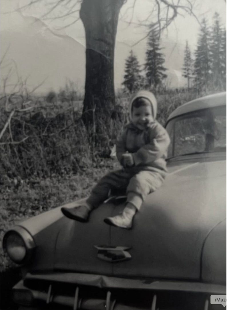
It’s one of those typical 1950s black-and-white photos found in our family albums, before the 1960s brought cheaper color film, Instamatic cameras, and those Polaroids where you could see the picture right away.
These always came across as ancient history — like something found in a history textbook rather than a real moment out of a someone’s life. Even as I know it is about 1957, it could have easily been judged as earlier, except for the car. Only the car gives a clue as to the time period, if you know enough about 1950s cars. So it doesn’t generate much of a sense of place and time.
And as far as “mood,” it’s hard to tell much unless you really study the shades of gray.
My early life was shrouded in enough shades of gray already. I wanted to see the real “me” from that time… get as close to the living, breathing, in-the-moment me as I could. Close enough to feel my cold breath on that winter day, and hear my laughter of delight sitting so big and proud on that car hood.
The details of a photo…
It’s not that you can’t pick out important information from that photo.
For example, I can tell it’s a sunny day – either early morning or late afternoon based on the sharp angle of sunlight and shadows on my snowsuit, the car hood, and the tree trunk.
Given my knowledge of that location – Klug Hill Road in West Torrington, CT — and which side of the tree and my snowsuit the sun is hitting, I suspect it is late afternoon.
Also, because I am wearing a snowsuit and the trees have no leaves, I know it is a winter day. The overcast tinge of the sky against the background points to a typical “partly sunny-partly cloudy,” very changeable New England winter day. And the suggestion of clouds on the bottom left horizon further confirms that the weather might change at any time.
The car is a Chevy sedan. Between the photo details, my knowledge of the car from family lore, my research, and my car-geek husband’s knowledge of 1950s Chevy sedans, I know it is a light blue, 1954 Chevy Belair sedan.
The dented front bumper documents the frequent car accidents my father had back then, which my mother used to complain about during my childhood.
Based on my size, type of shoes, and clothing, as well as personal knowledge such as when I was born and details from a few other pictures of that day, I can estimate my age to be about 2 years old. So the photo is circa 1957.
And I am smiling. So, at the very least, at this moment, life is okay.
So, yes, it is very possible to extract a lot of information from that black-and-white photo. Yet there is a distance to that photo, and a distance to me. I can “analyze” that picture and deduce things, but I sure don’t “feel me,” or like I am even real.
Now, consider the painted image.
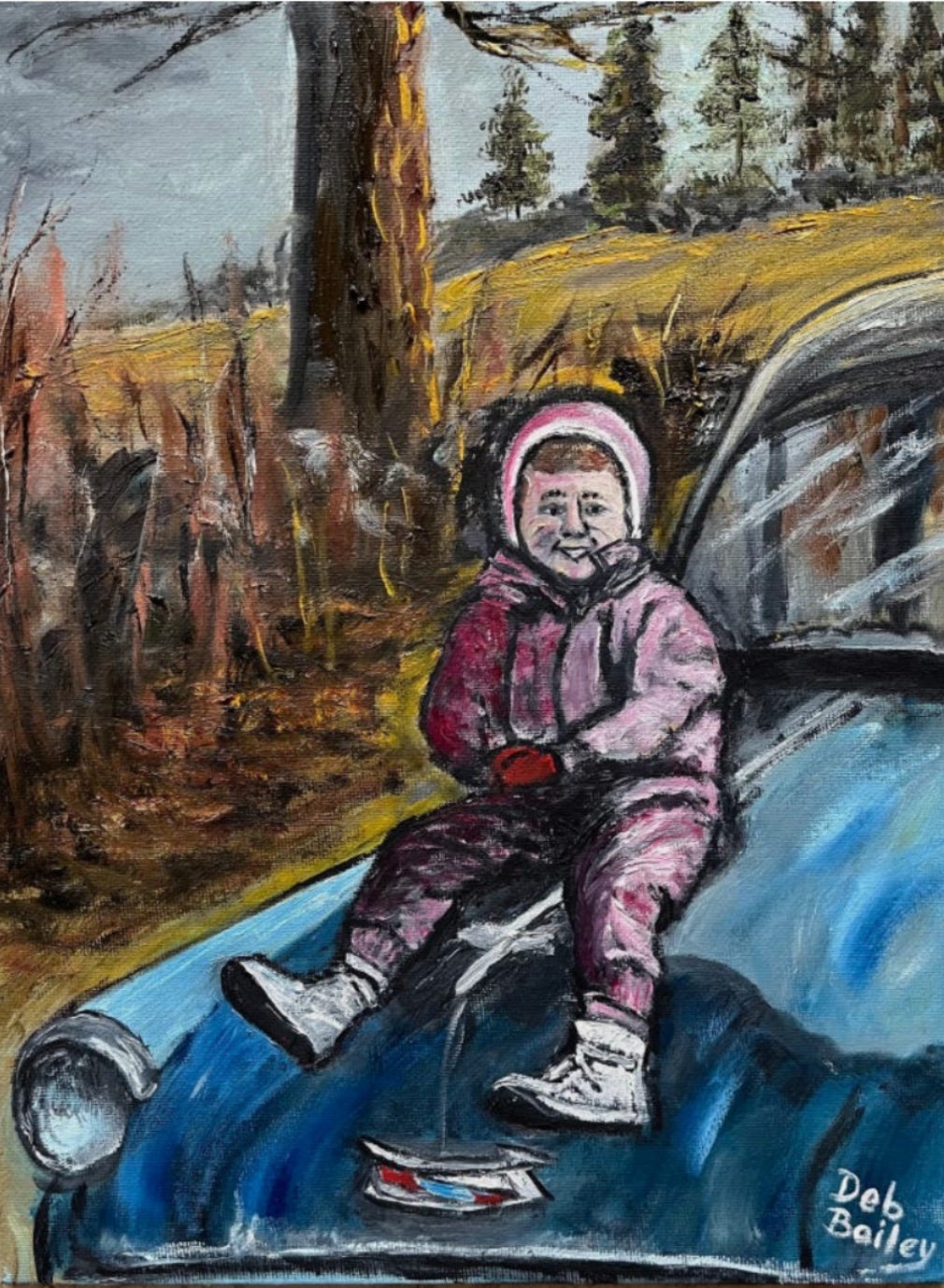
When I painted it, I didn’t fabricate anything about it. Yet the painted scene has a very different quality. There is something about casting it in full color that enhances that moment and infuses it with life, energy, and emotion.
It’s one thing to deduce from the details that it was a sunny, winter, late afternoon. It’s another thing to see and feel that late afternoon sun casting shadows across a car hood and a bleak, leafless landscape. Color brings an immediacy to the moment that gray tones just don’t. This moment could be happening right now, old car notwithstanding.
Color brings the “me of that moment” back to life, and I can feel her presence, her nature, her joy, in living color right now. Color also adds more awareness of mood. The darker horizon clouds contrast sharply with the sunny spots of the field to give an uneasy quality to the scene. That joy and sun could evaporate in a moment. Brightness… and joy… are not guaranteed.
So, it was my way to bring the “me of that moment” back to life RIGHT NOW. I feel her joy, sense her soul, right now, instead of being separated by many decades of ancient history.
And by being with her right now, I, the adult, can see just how vulnerable she is. Powerless. Innocent. Pure. She was not damaged goods or stupid for believing him when he said his abuse was love and protected the family. She couldn’t have “known better,” and she was NOT responsible for what happened.
Using color reduces the “time and emotional distance” of that image, which is also important to the person who reads this book. If the image feels “old,” it may not feel relevant to the reader. It has a sense of “Well, that was ancient history… that was then; it’s not now.”
And the reader can more easily make an emotional connection to the child in that color image. And they don’t have to work as hard to “insert what the colors, mood, and situation” would be as they do with a Black-and-White image.
One last word about color
My use of color in the painting varies considerably by subject and mood. Sometimes the palette is a very limited set of subdued grays.
Another time, I use bold pure solid colors with little depth or shading, almost like a primary school artwork done by a child. Or to convey intense emotion.
Some of the paintings are very realistic, and so for those I use a very complex palette of colors to achieve shading, highlights, depth, and perspective.
And lastly, the colors I use for people and especially their faces vary considerably. I have some self-portraits that are more blue-gray to capture the emotional pain. Others that are bright and represent the joy of a breakthrough.
For images of my father, I use colors that convey rage, evil, or horror instead of realistic skin tones. Sometimes his face is almost black with rage, blue for creepy scenes, but generally, they are “unreal” colors. But then, was he a “real” person?
I think he was an empty shell of a person… one of those “Hungry Ghosts” described in Buddhism, where a person is tormented by intense, insatiable cravings that can never be satisfied. My father spent his life behind ever-shifting facades. So I don’t think he even knew who he was, and he certainly wasn’t happy.
How do I start an art piece?
The first thing I do is to quickly jot down a list of all the memories that are clamoring to be painted. Then, without much conscious thought, I just pick one and start. Whichever one immediately jumps up and says “Me first!”
I do a quick sketch to capture the scene, energy, and emotion, and jot any details that come up in that moment. I do it quickly so I can stay out of the way of my memory and just let an inner guide drive the process.
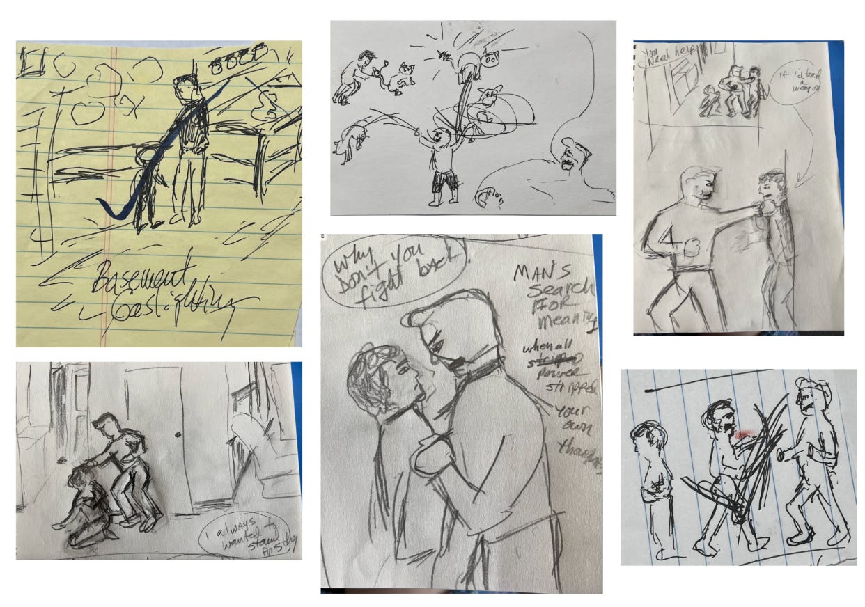
I’ve also noted that the faster I sketch without consciously thinking about it, the more details show up in the sketch without my even trying.
Finally, I move on to what style best suits the image I need to create
Style choices
I have four main style approaches:
- Abstract – These are used to express raw, intense emotions that have no words strong enough to express what I am feeling
- Primitive/Simple – I use this approach to capture real moments, often violent or intense ones, and often ones from either my childhood or from nightmares. They are all about showing what was happening at the moment, not about artistic precision.
- Realistic/Detailed – Depending on what I am writing about, sometimes a very detailed and realistic approach works best
- Metaphorical/Symbolic – These may be paintings that reveal some piece of logic or fact, something from a nightmare, or charts and maps.
Based on whatever my gut tells me in that moment, that’s what I pick. And with rare exception, I’ve never changed an approach. It seems that my emotions and memories know exactly how the image should be handled, whether it’s realism, primitive, symbolic, or just pure abstract feelings.
Up next
In the next post, I’ll share some closing thoughts about my use of art in this book, then move on to the remaining “Tools.”
In between those, I will also share a recent “Moment of Challenge” – a traumatic experience that totally triggered me. Yet, despite it hitting many nerves in me, I stood up for myself…evidence that however much this effort is a struggle, there IS progress….
Note:
I am seeking financial support to complete my memoir, work with an editor, and make a visit to my home state for fact-checking. Your help would mean the world to me as I take this step toward healing and giving voice to my journey.
Please like, comment, and share this post to help spread the word. The link for my fundraiser is on GoFundMe. Thank you for your support.

Leave a comment