HOW DO YOU “SEE” A FICTIONAL TOWN?.
I am a visual learner so I need to see it to “know” it.. How do you “see” a fictional story location? For me, I started with the “real world.”
Travel magazines and postcards of Rhode Island, Cape Cod and Narragansett Bay were a help, but not enough. So I spent one Christmas break compiling a 3 foot by 4 foot topographical map of Narragansett Bay. I found it on the web on a geological survey site and proceeded to print it out, quadrant by quadrant. Then I taped them all together until I had the complete topographical map of Narragansett Bay, including all the islands and the surrounding land areas. My husband did question if it might not have been cheaper and easier to just buy the map, but frankly, I don’t think I could have bought the entire map that I ended up with. In any event, this gave me a “visual” of sorts to know what the land around the bay was like. I could tell that while the area is not that far above sea level, there most definitely are hills and ridges, marshes and sand dunes.
The next thing I had to do was make the imaginary town a real place to me. I started by printing photos of diners, stone warehouse buildings, rocky coastlines, Fort Adams, docks and wharves, and even that building at Woods Hole with the sailing ship model jutting out from the stone wall above the doorway.
Once I had an idea of the kinds of items and places my town included, I created a map of the town. Now I could “see” where Max’s house stood in relation to Carbone’s Auto Body shop, the diner, the rich uptown area, Lighthouse Point, her school, and the downtown dock areas. I could see how much area the Naval Research base took up on Lighthouse point, where the pier and research labs were in relation to the haunted carriage house and the Yacht club, and how far of a walk it was back to the town and the diner.
Next I needed to see Max’s house and yard. I grew up in those three-family houses, so I had an idea in my mind of how they would be set up – back staircases, front and back porches, attic rooms with slanting walls, stone wall cellars that spooked you every time you had to go down there. I did a map of Max’s neighborhood, and a blueprint of both hers and Noah’s house, showing all three floors in each. I wanted to “see what she saw” when she looked out her attic window. From the map-making kit I had as a kid, I knew about doing room plans, so I could tell where the kitchen stove was, how many couches were in the living room, and if they had a computer desk. With these, I could now see Max’s house, her backyard, her neighborhood, and how it connected to everything else in town.
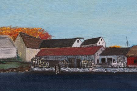
Rosa’s Midway Diner is such a big part of the story that it required equal attention. I have been in a number of diners over the years, so I had some mental images. I found a number of good books on diners, and consulted the American Diner Museum website. I even went to the local diner here in town (Cary, North Carolina) and with the permission of the owner, took a couple hundred interior shots of tables, counters, stools, equipment, pass-through windows from the kitchen, plates, etc.
From all of that, I created a blueprint of Rosa’s Midway Diner. I drew up the “diner of my dreams,” the one I would build if I had the money. If this book ever sells big, I swear I’ll build it. It has regular booth seating including the large back semi-circular booth that Rosa uses for her Friday night poker games. It has a large window behind it made of those glass blocks, and all tables have roses in the vases. There’s an extra long counter with stools, another counter in the front of the diner where you can sit, sip your coffee, read the paper and look out on Main Street, and a large take-out area for walk-in business. And of course, there is the new drive-through being installed as part of the take-out area.
The diner itself is a character in the book. As such, I have created a “biography” of the diner – a timeline of how it started, who created it, where it was located over the years, expansions…the whole works. Before I’m done with this, I will do an oil painting of that diner, both outside, and in. To that end, I have a very rough cardboard model of part of the diner interior, that includes the kitchen pass-through, counter and stools, and the drive-through areas
To further give the diner reality and context, I did a map of the diner area and Main Street. I felt it was important to show where the diner was in relation to all the businesses mentioned in the story, as well as to the rest of the town.
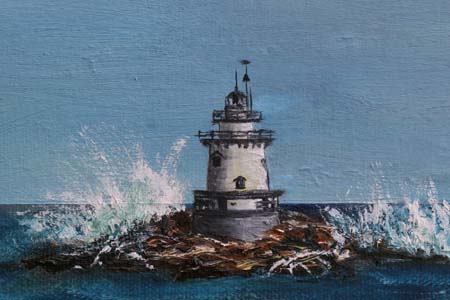
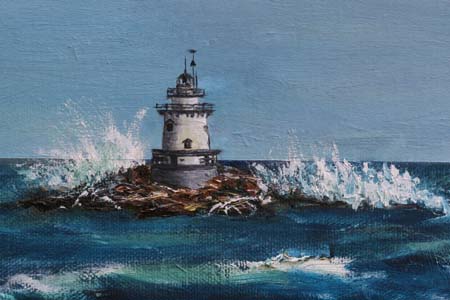
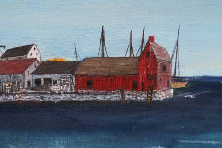
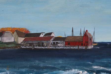
Lighthouse Point is another important part of the story and required “visuals” and biographies. I wrote up the story of the ship’s captain who built the lighthouse and surrounding stone warehouses and who died along with his family, in the fire that destroyed his mansion. I also created a map of the area around the haunted carriage house, and blueprints of the abandoned ammo bunkers and anti-aircraft gun emplacements right near the carriage house ruins.
For Uncle Jim’s lab, I chose the stone building at Woods Hole Oceanographic Institute, the former “Candle House.” I even gave Uncle Jim’s lab a similar sailing ship model jutting out from the exterior wall over the doorway. Interior shots of other buildings at Woods Hole served as inspiration for the lab and office interiors of those buildings.
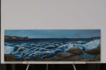
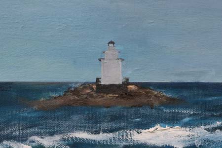
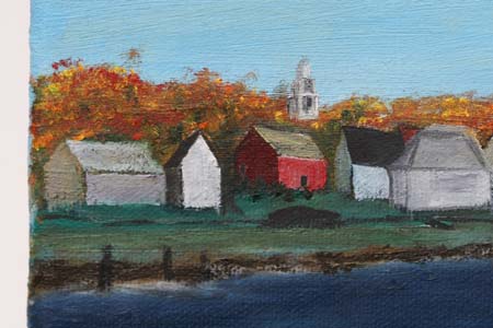
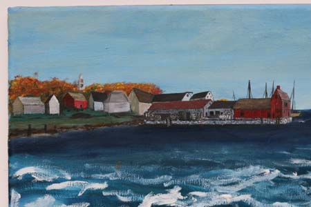
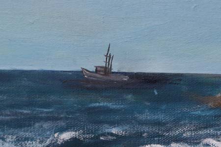
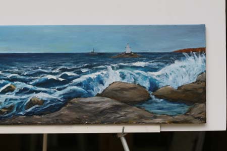
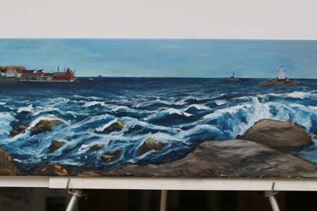
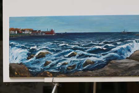
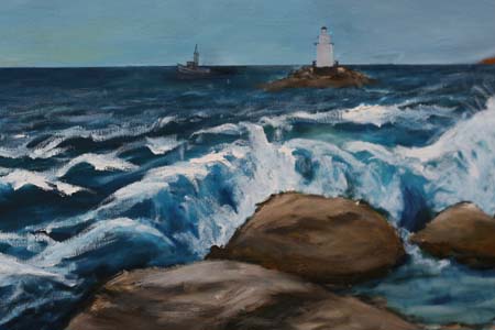
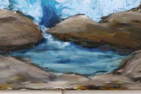
Since paintings have such power for me, I did a 24 by 36 inch oil painting of where the two story worlds meet – the rocky coastline at Lighthouse Point. Every item in the painting is in the story – from the hermit crab, Carpus, who is right up front, to the lighthouse and rocky point, wooden pier, tide pool area, distant fishing trawler, fort on the hill, research labs and …yes, the ghosts.
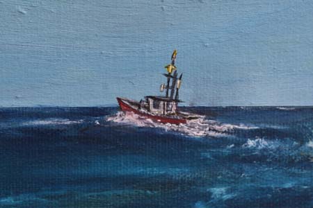
The University of Rhode Island’s Graduate School of Oceanography is the barely veiled location of the university in the story. I gave Jerry a research lab located in a former World War II ammunition bunker, and had her out doing her environmental research on a university-sponsored ocean-going research vessel, very similar to the R/V Endeavor. I verified the research itineraries, including places visited, work performed, and the durations of cruises, from the various research vessel ship logs online. I also studied the online blueprints for these existing research ships, to see the locations of labs, bunks, galleys, as well as the rules for running such a ship and expedition.
For the museum lobby where Max sneaks up to, to file her contest entry, I did rely on a memory – a very strong one burned in my brain from early childhood. In Torrington, CT, the post office at that time was in a brick building in the center of town. (It is now further out in a refurbished old supermarket building.) The post office lobby, while a very wide open area, was a scary place to me. At one end were the faces of numerous FBI fugitives staring out from black and white printouts pinned to bulletin boards.
It was the other end of the post office lobby though, near all the service windows, that truly freaked me out for a long time. Above the windows, high up on the walls all around that part of the building, were these huge murals. They showed 1800s men and women trudging through mud, beside a Conestoga wagon. There were also other scenes of 1800s life – all scenes actually, from the life of the abolitionist, John Brown. The murals themselves were intimidating enough, but ….silly as it sounds, I thought they were alive. Standing in that post office lobby waiting for my mom, I would stare up at the wall paintings and listen to the loud voices echoing off the walls around me. I thought the figures were speaking. In reality, the echoes were the voices of the postmen behind the wall yelling back and forth to each other. But to a 4 or 5 year old staring up at scary murals, the voices came out of the paintings, out of these solemn, angry looking people struggling behind their oxen in the mud. Hence, the inspiration for the museum lobby murals that Max sees.
By the way, if you are visual too, click here to see the murals from the old Torrington, CT Post Office.
Click here to read more about the history behind Connecticut post office art work done in the 1930s Depression era as part of the New Deal.
The other items I consulted to “see” the location, involved technical things like weather charts, articles on ocean fog, articles and nature guides describing the trees, birds, types of rocks, and area geological history. And I asked questions – of myself, of my sister living up there, of Google: What is the air temperature at night in June? Are there any sea breezes? How fast do storms move in, from which direction and how bad do they get? What do your clothes feel like against your body when you’re walking near the shore – crisp and dry, or soggy and limp? Do you need a jacket to walk around at night in the summer? Do you need a wetsuit to scuba dive in July?
Aside from visuals, I needed “sound” to further “see” the place. I selected CDs based on the emotions they created in me. When you watch TV, the music tells you if something funny, poignant, or ominous is taking place. In the same fashion I needed music or sound so I could see the events as they occurred in the story and feel the emotions of that moment and location. I played those CDs over and over and over, while writing in my garage. I am amazed my husband and my neighbors are still sane.
Some of these CDs include the soundtracks from: The Band of Brothers, Cinderella Man, We Were Young Once, and the Perfect Storm. There are also ocean and bird sound CDs, Gregorian Chants, and last but not least, Rosa’s “Frankie boy,” Frank Sinatra. But be assured, there are NO Dean Martin CDs. Just for the record, I personally have nothing against Dean Martin and I LOVE his song, “That’s Amore,” but you can never account for what your characters will love or hate. Rosa hates Dean. Plain and simple.
Next up – Let’s Get Technical. Stay tuned.